Human needs and the design process
When I was doing my graduate studies, one of my favourite subjects was one called ‘Designing Human Computer Interaction’. The focus of the course was on the theory and practices on designing how users interact with artificial systems. Beyond the technical aspects there was also the cognitive aspects of how users think and work with systems, and the considerations to take into view when design user interfaces and user experiences.
As I started to read and research more into design and design principals I started recognising designs and patterns outside of digital technology and in the physical world, and I started to build a respect and appreciation for the process.
The Hierarchy of needs in design
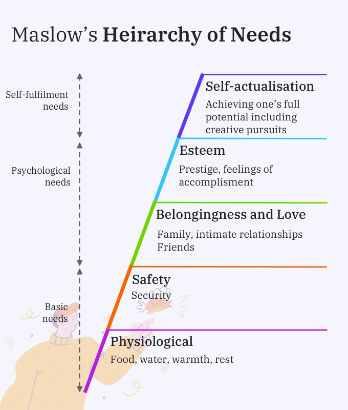
Maslow’s Hierarchy of Needs is a motivational theory in psychology proposed by psychologist Abraham Maslow. This theory was published in his 1943 paper “A Theory of Human Motivation” and is usually represented using a pyramid showing human needs.
The needs at the bottom of the pyramid are the most basic. To meet the needs at the next level, the current level must be satisfied. The needs are physiological, safety, Belongingness and love, esteem, and self-actualisation.

The theory says that humans are motivated to fulfil their basic needs before their more advanced needs. A person who has not eaten can not be expected to work on creative pursuits. Evolution will compel them to meet their survival needs first.
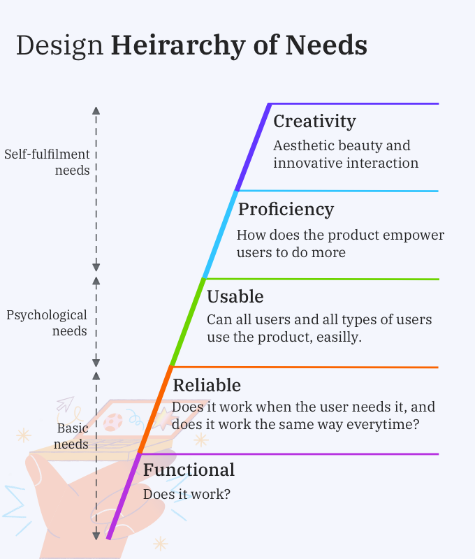
I’ts possible to apply Maslow’s hierarchy to other fields and design is no exception. Each product or user interface must meet the needs of the level below it - i.e. it must setup the groundwork for the next level. For e.g. there is no point in focusing on aesthetics if the basic functionality is not met. Steven Bradley formulated this hierarchy in 2010.

Functional
A design must be functional before anything else. Consider a toaster. A toaster would need to make toast to a defined temperature level for two slices of bread at a minimum. If it can’t do that then the design has failed.
However a design that only meets basic functionality is of little to no value. A toaster with just 3 browning settings would likely not get added to the Amazon cart. A design is expected to meet basic functional needs; achieving that is nothing special. Number of additional features is another consideration. If all the toasters in the market offer at least 8 browning settings, an eject button, then the market has decided that those are the minimum options required.
In the digital world a website that meets functionality needs might have pages that load in a reasonable amount of time, has working links and pages that respond to basic browser buttons like “Back” and “Forward.”
Reliable
The next requirement is reliability. The design should offer stable and consistent performance, again, and again. A toaster set at 4 must prepare toast at the same level of browning in the same amount of time every time. A website should function consistently, what worked yesterday should work tomorrow and day after tomorrow. Reliability & Functionality together form the basic needs of design. Without achieving these two needs, there is not proper service of the higher needs.
Usable
When considering Usability we start looking at ease of use for all users. The design now works consistently, but how complicated it is for people to figure out how to use it? Is the design forgiving to user mistakes and errors? Can everyone use the toaster safely? Is it possible to push the level with one finger lightly without having to use the other hand to hold the toaster? Can someone with arthritis easily use the lever?
A usable website may have a simple and easy to understand navigation system, a content hierarchy that is easy to browse. Readable text, accessible text.
Usability begins to add value to a product.
Proficiency
When we start discussing the Proficiency tier, we need to get a few more features in our toaster.
Consider that our toaster has more features, it can make 4 slices of bread, has a warming rack and has a defrost function. These are proficiency needs. These features are not necessary, but they add more value to the product. If you like to warm your croissant in the morning before you have it with your glass of OJ, you might be willing to pay more for our 4 slice Toast-O-Matic.
Proficient designs are perceived to function at a high level. A design that allows people to do things not previously possible and to expand on basic functionality is considered to be great.
A proficient website might include advanced search options, the ability to combine data from different sources into more sophisticated levels of information and usable tools.
Creativity
The top-tier of design needs is Creativity. Which should ideally be attempted when all the lower needs are met. Creativity assigns focus on aesthetics and innovation in using the product.
Our toaster is now designed as a statement piece with enamelled coloured panels. It is intelligent, and it starts making toast when you tell Siri to start making your breakfast when you step out of the shower.
A creative website works hard for aesthetic appeal, and modern interactions.
Designs that meet creative needs are perceived to be of the highest level and they are the ones that generate a returning customer base.
How does the design process fail users?
Understanding the Hierarchy of Design shows how a product gets made and how needs get layered as a product. But there are limitations of the model. While the hierarchy makes sense intuitively, it faces some challenges when it starts getting executed. Especially when the product features are getting listed.
All designs have to start by researching the needs of people who will be using the product. Scientific methods of user research will create cohorts and archetypes and try and establish features and functions for the product that they believe the user will - use.
Empirical studies will confirm that the design decisions taken meet the needs of the great majority of the users; and the product manager will have the sense of accomplishment on having led the delivery of a product that is functional, and reliable.
Impacted with the variables of time and money - getting to the market on time, and on a defined budget, this process will meet its goal - The user can use the product and meet the functional requirement.
The problem with this approach is that usually features are proposed in a “Design by Committee” mode and then scientific principals will be applied to underscore the chosen features. As a result features are cherry picked from all levels of the hierarchy, without truly building the lower layer.
Let’s look at our toaster analogy again. Consider the toaster in the image below.

By our previously set rubric, it can prepare up to four slices of bread together, it has two separate levers that can be pulled down (easier), it has seven browning settings. It still can’t heat my croissant, but it has the room to toast a bagel. And a stainless steel design with a black body which answers to aesthetics.
When you tried to use it however, this happened :-
This toaster obviously passed the design by committee stage, because it was listed on Amazon, you could actually buy this product. But as the video illustrates, it may not have been thought through. It may not have gone through extensive testing, but it may have focused form over function.
Which brings us to this consideration,
Indifference towards people and the reality in which they live is actually the one and only cardinal sin in design. – Dieter Rams
Staying true to human needs
All products that our designed, websites that are created, webapps that are made are made and designed for humans. The hierarchy we spoke about it no means perfect. There are always the principals of economics which override any decision.
In today’s hyper connected world, public reaction to design, language, imagery can trigger immediate feedback. A designer has to be receptive to these feedback and listen with an open mind. It is possible that some considerations can be made for the feedback received. And even if immediate attention cannot be made (in the case of a physical product) a designer should be willing to take this feedback into their next product and design decisions.